One of our goals here at Wiltshire Design is to work towards making good design
the norm.
Here’s a sneak peak into some of the work and process behind the pretty images in our articles.
Dramatic Renders
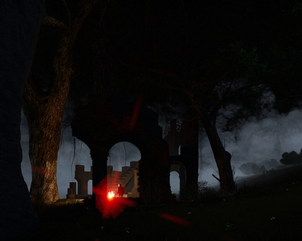
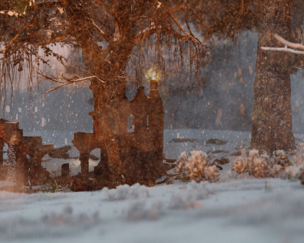
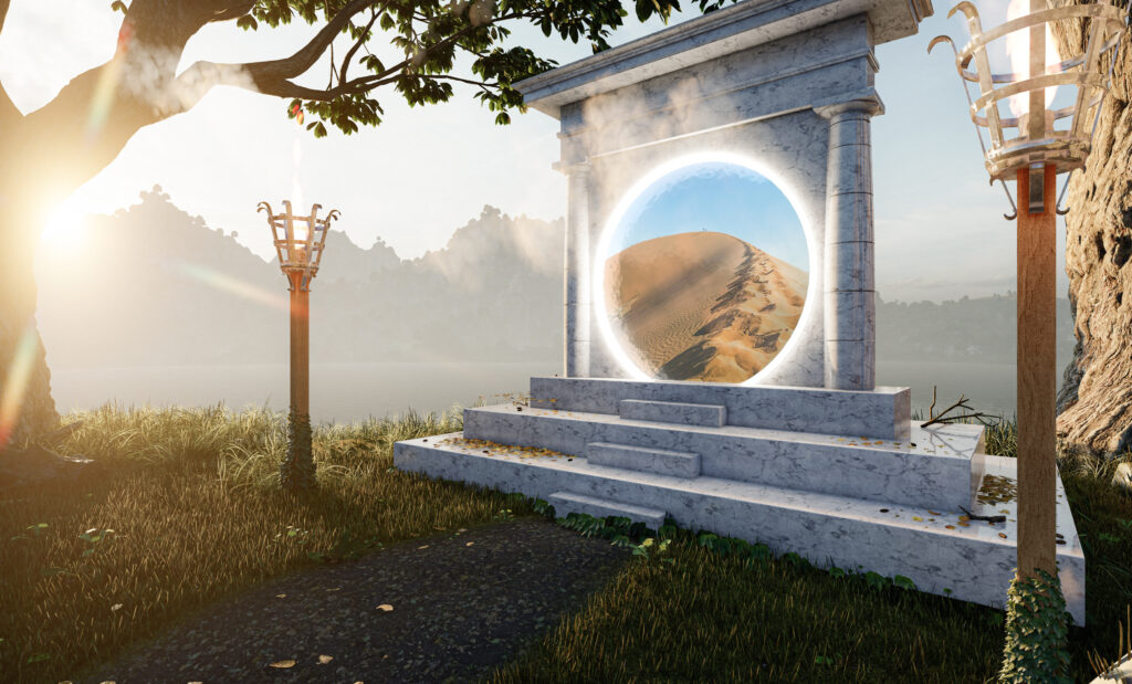

These renders were designed to wow the viewer. To instigate the viewer’s imagination. Each one of these has a story behind the image to help generate an image that is interesting and visually appealing.
These images are meant to be over the top, bold. None of the above images were created for any reason other than to experiment with modelling and rendering. They were all born out of an idea in the back of my head of something that I wanted to try out and see how it looks; be that idea a bright light coming through mist, an ancient ruin profiled against a dark night, or something as simple as experimenting with Lumion’s 3D grass.
Informative Renders
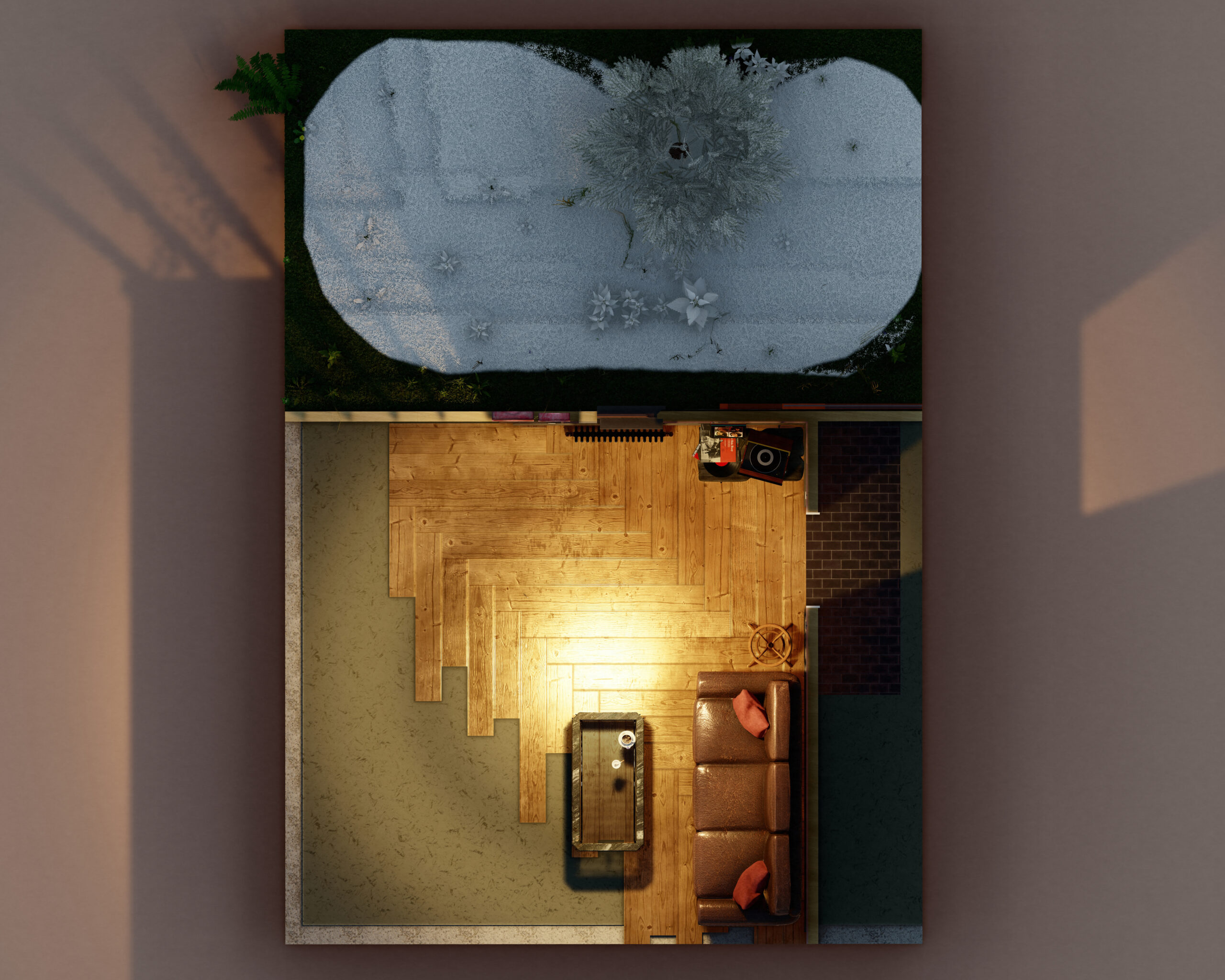
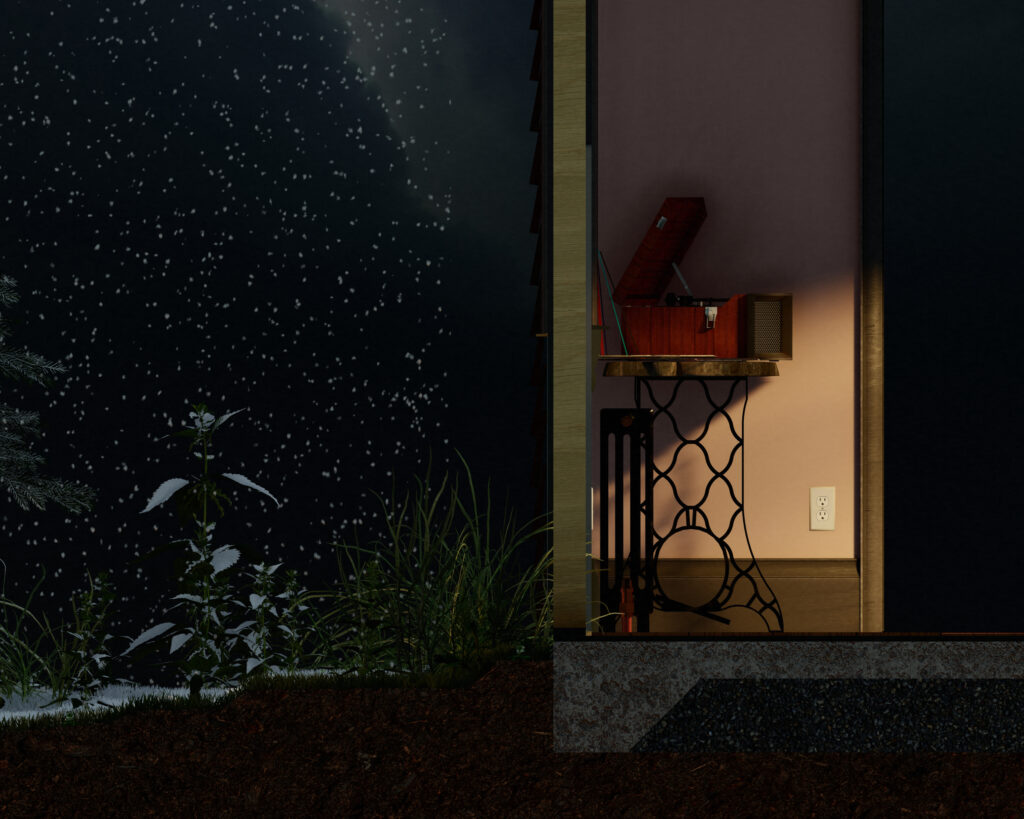
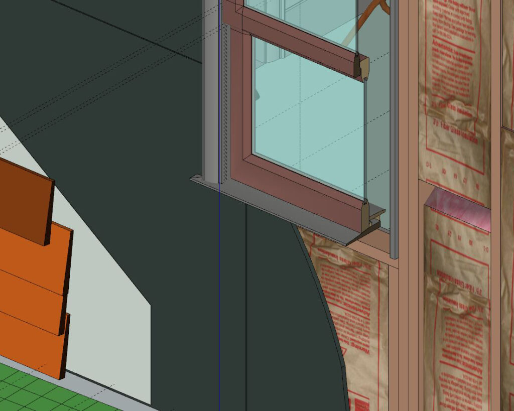
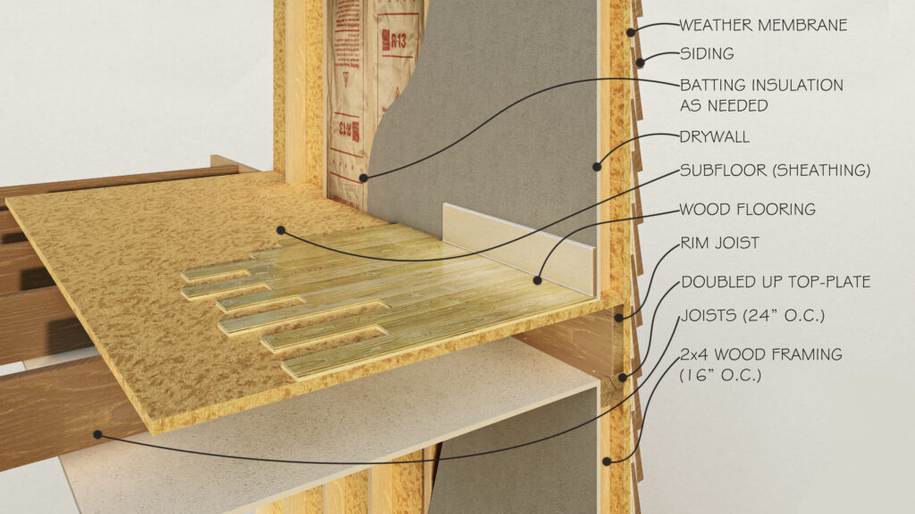
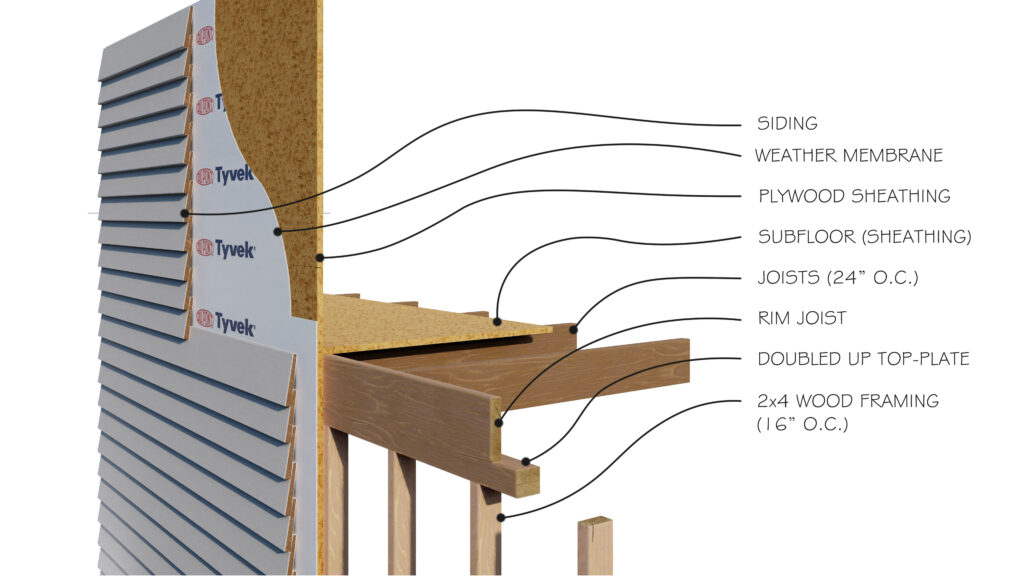
These renders are designed to convey specific information to the viewer.
The most obvious examples of that are the construction details. The idea of rendering construction details in photo-realism, utilizing both skill in 3D modelling/rendering, and knowledge of how a building really goes together, is what Wiltshire Design is all about. We strongly believe that the raw nuts and bolts of how buildings go together doesn’t have to be a bland subject, it should be beautiful.
“We strongly believe that the raw nuts and bolts of how buildings go together doesn’t have to be a bland subject, it should be beautiful“
When creating an informative render, there are key elements to pay attention to that otherwise may not matter. For example, if text is going to be added in post-processing, such as the call-outs in the construction details, that is going to matter a lot to the initial composition of the image when setting up the render.
Another key point to consider is that often light may fall naturally to create some areas that are very dark in your render. This is fine, even good, when creating a dramatic render purely for visual interest. In an informative render, however, it is essential to note where you need the viewer to still see. For example, take the section above showing off the thickened slab and wall section. Here, the areas around the wall-section, especially outside, is very dark. That information is not important for what this render is trying to convey. What is still dark, but not so dark to be illegible, is the concrete slab and the details of the wall. These areas would naturally appear dark in this render, so were lightened in Photoshop after the fact. They are still left fairly dark, so as to seem realistic, but lightened to the point of being legible.
