The Art of the Perfect Lumion Material
When I started working on renderings in Lumion, I got overly excited at how awesome I could create reflections, then I got overly exciting at the weathering slider, then the displacement slider, and so on. And none of these excitements helped me to create realistic materials, only exaggerated impressions.
I’m not saying don’t be excited.
The art of the perfect Lumion material is the art of moderation. Learning how to only just nudge up sliders, and how much reflection is realistic, this is the sort of education needed to create realistic materials in Lumion.
Lumion is a powerful tool. It begins to scratch the sort of rendering power we see in tools such as Blender and 3DS Max, while maintaining a level of ease that isn’t far surpassed by tools such as Enscape.
And yet, much of this power comes from the many settings that we are given through Lumion. And much of the ease comes from the intuitive sliders that we can play with for each setting. But this power and ease can lead many astray. I speak, of course, from personal experience.
But this power and ease can lead many astray. I speak, of course, from personal experience.
So how do we achieve believable materials? How do we break away from being unsure what we are doing and ending with unrealistic results?
Let’s dive a little deeper into each setting in Lumion to understand exactly what we are working with.
Coloration
This is what it says it is. I prefer to try and achieve the right material by having a more successful color map, rather than using the colorization slider. But sometimes it’s just quicker, and delivers similar results.
The colorization slider is a quick and easy way to have varying woods, say, in a timber framed structure. It can help add some variety quickly.
However, try to use the colorization as little as you can get away with, as the higher the colorization, the more detail you will lose from your actual color map.
“However, try to use the colorization as little as you can get away with, as the higher the colorization, the more detail you will lose from your actual color map.”
Gloss and Reflectivity
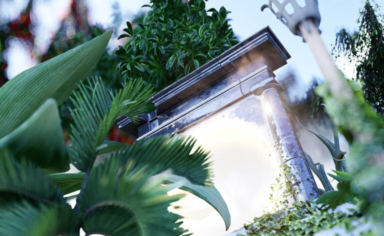
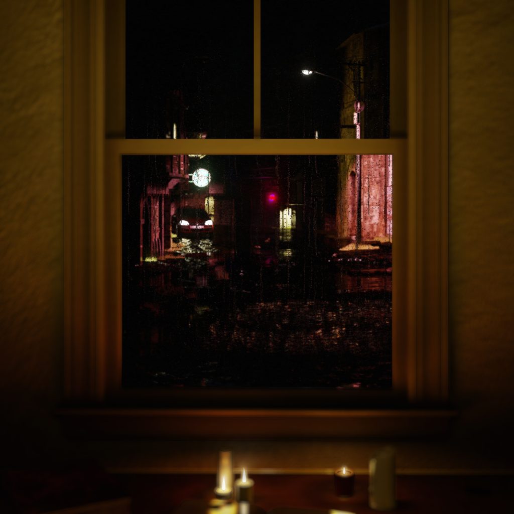
The reflections and gloss sliders were sliders I always had a hard time differentiating. The easiest way to understand the difference, is that the reflection of a material is exactly that, it is how much it is reflecting. But the gloss of a material is how sharp or burry those reflections are. For example, if the reflection slider is at max and the gloss slider is at max, you will have a perfect mirror. If the reflection is at max and the gloss is at ¾, you will see reflections well, but they will have become blurry. Possibly like a piece of glossy plastic.
If your gloss is at max and your reflections are at ¾, you will have an object that is very shiny and glossy, reflecting light more than images. A comparable object may be a piece of wood with a very high gloss finish.
Relief (and roughness maps)
In Lumion relief is gained through normal maps, typically purple. The key to a good normal map is, as obvious as it may sound, knowing what you are modelling. It is so easy to overdo a normal map. I very rarely use it past ¾ of the slider.
The difference between normal maps and displacement maps is also crucial to understand. In effect, normal maps help to shade a surface. They work well for wood grain, or the surface of clay. In essence, they work very well for the texture of a material.
A displacement map, on the other hand, can actually cast shadow. They work much better to pulling out dramatic differences in depth for a material on the whole. Good use of a displacement map would be to simulate siding or bricks. The actual texture on the siding or bricks can be brought out well with either a detailed displacement map, or a normal map.
Normal maps can also be used to load roughness maps into Lumion, which in my mind are essential for believable or realistic renders. I wrote more about this, and how to do it, in this article here.
Displacement
As previously mentioned, displacement maps are like the big brother to normal maps. They help pull out differences in depth on a material on a grander scale. But it is so easy to overdo a displacement map.
When working on the displacement of a material, try to get as close to the material as possible to actually see the relief you are creating in the material.
“When working on the displacement of a material, try to get as close to the material as possible to actually see the relief you are creating in the material.”
I almost never bring my displacement slider to max. The material will be jagged and look like shards, and not at all realistic.
Map Scale
A map scale is how large or small your material is. There’s a couple good things to note here.
Often a material will already have an ‘imported’ scale associated with it. Usually this scale is spot on, however as you may have already guessed, it is often not. Always check to see if your scale actually makes sense.
“Always check to see if your scale actually makes sense.”
To achieve a correct scale it pays to have something that you know is scaled correctly next to your material. A simple but effective tool is to just place a person next to your material. As people, we intrinsically can tell if something is not normal or out of place, especially with another person close to it.
Next, I recommend pulling up images of the material (ideally with a person for scale in the images), or looking at the physical material if that’s possible. When scaling, try to achieve as close as possible to a typical scale first before tweaking the scale for your unique project, as it will give a great starting point.
Extended Settings
Position/Orientation
The first two tabs under extended settings are position and orientation. These may seem trivial, but achieving materials that properly turn corners, or terminate cleanly, is very important.
Fiddling with the position of a material lets you move the maps along any of the three major axes. Note that when looking at one face of a material, you can only ever see the effects of two of the offsets. Use these offsets to start or finish a repeating material properly. For example, finishing tile on a whole tile, or starting a wall of siding on a whole piece of siding.
“Use these offsets to start or finish a repeating material properly. For example, finishing tile on a whole tile, or starting a wall of siding on a whole piece of siding”
The orientation of a material is also very important. This relates to how the material is laid on a single face of a material, say the direction of wood grain for example, and also how a material turns a corner. Take our siding example, it is easy to perfect a material only to find out that as soon as it turns a corner the material flips to running siding up and down.
The heading, pitch, and bank settings all control these aspects of a material. The easiest way to understand these differences is to tweak them one by one until the material is working how it is intended.
Transparency/Waxiness
Transparency is simply how opaque to transparent a material is. For materials that are glasses, I recommend selecting ‘glass’ or ‘glass advanced’ from the custom material library, or selecting and editing a pre-existing glass in either ‘Indoor’ or ‘Outdoor’ glass presets.
When working with a slightly transparent object such as a fabric, I recommend creating the material from scratch through the custom > standard selection through material library.
The key to a believable semi-transparent object such as a fabric is using a transparency map, loaded through the alpha channel of the normal map. Read more about that here, replacing roughness maps for transparency maps.
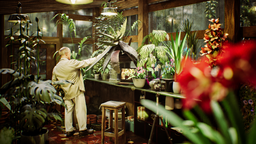
Waxiness is Lumion’s term for subsurface scattering. This is the effect that illuminates your hand when you shine a light through it. For some materials it is essential. The most common situation that I use it in on a daily basis is with plants. A slight waxiness on leaves let’s some light pass through and illuminate the leaves. Watch a great video explaining it all here.
“Waxiness is Lumion’s term for sub-surface scattering. This is the effect that illuminates your hand when you shine a light through it. For some materials it is essential“
I try to avoid maxing out waxiness settings. I have found sliding above about half way starts to prevent the interior of the object from passing light through. This may be appropriate in some situations, but I find it’s rarely useful for what I work on. I tend to keep it around 0.1 to 0.2 for most leaves.
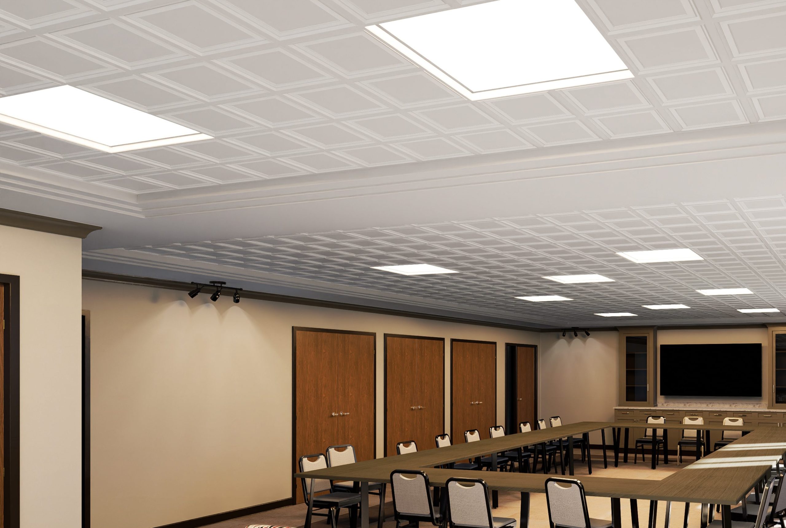
Emissive
Using the emissive slider will make an object glow and emit light. I very rarely use this to actually illuminate a scene. The issue with the emissive slider is that it only illuminates when the camera can actually see the material. When the material can’t be seen, it doesn’t produce light. To illuminate a scene I just place the built in Lumion lights. I find I can get plenty of control from these.
Instead, I use the emissive slider to visually be able to see an object glow.
Note the use of the emissive slider here to have the desktop monitor and the keyboard glow.
Saturation
The saturation slider is simply how saturated the color map of the material is. By default, the saturation is set to 1.0.
When the saturation is set all the way down, the material will appear black and white. When set all the way up, the material will be one monotone color. I rarely use the saturation slider, and instead try to achieve the desired material from the color map. Sometimes, however, it is quick and easy to copy a material to another object and differentiate the materials quickly by slightly editing the saturation and colorization of the object. This can be useful when you desire to have woods slightly differ from plank to plank, while clearly being the same type of wood.
Specular
The specular slider controls the specular highlights of a material. This is a slider that it is easy to mess up a material with. By default the specular slider is set to 0.0.
A specular highlight occurs when a shiny or glossy object reflects light directly back into the camera or at viewer. How that specular highlight is reflected back to the viewer is what is controlled by the specular slider.
The most important materials to use the specular highlight on are metals. Metals have a unique specular highlight which no other material replicates. Although it isn’t possible to replicate it exactly in Lumion, it is possible to approximate it. A specular index of around 0.15-0.2 can work quite convincingly, but it is best to experiment with this, as different materials may have drastically different results. If you are unsure, err on the side of having the specular too low, as too high will draw attention to a potentially erroneous material.
If you are unsure, err on the side of having the specular too low, as too high will draw attention to a potentially erroneous material.
Here is a great video that goes into more depth over the specular slider
Flicker reduction
Flicker reduction is a slider that I have never used. I mean never. It works when two separate surfaces are in the same plane, and as you move around and zoom in and out the surfaces will flicker from one to another, as Lumion doesn’t know which one to show. The flicker reduction helps to reduce this. However, it should never occur in a well constructed model. It is famous for occurring in Sketchup models, but in my experience, it is all too easy to fix and resolve. I strongly recommend taking the time to fix any flicker issues you are experiencing with your model, as it can let down your renders immediately.
Subscribe to our newsletter for short and helpful industry tips!
![]()